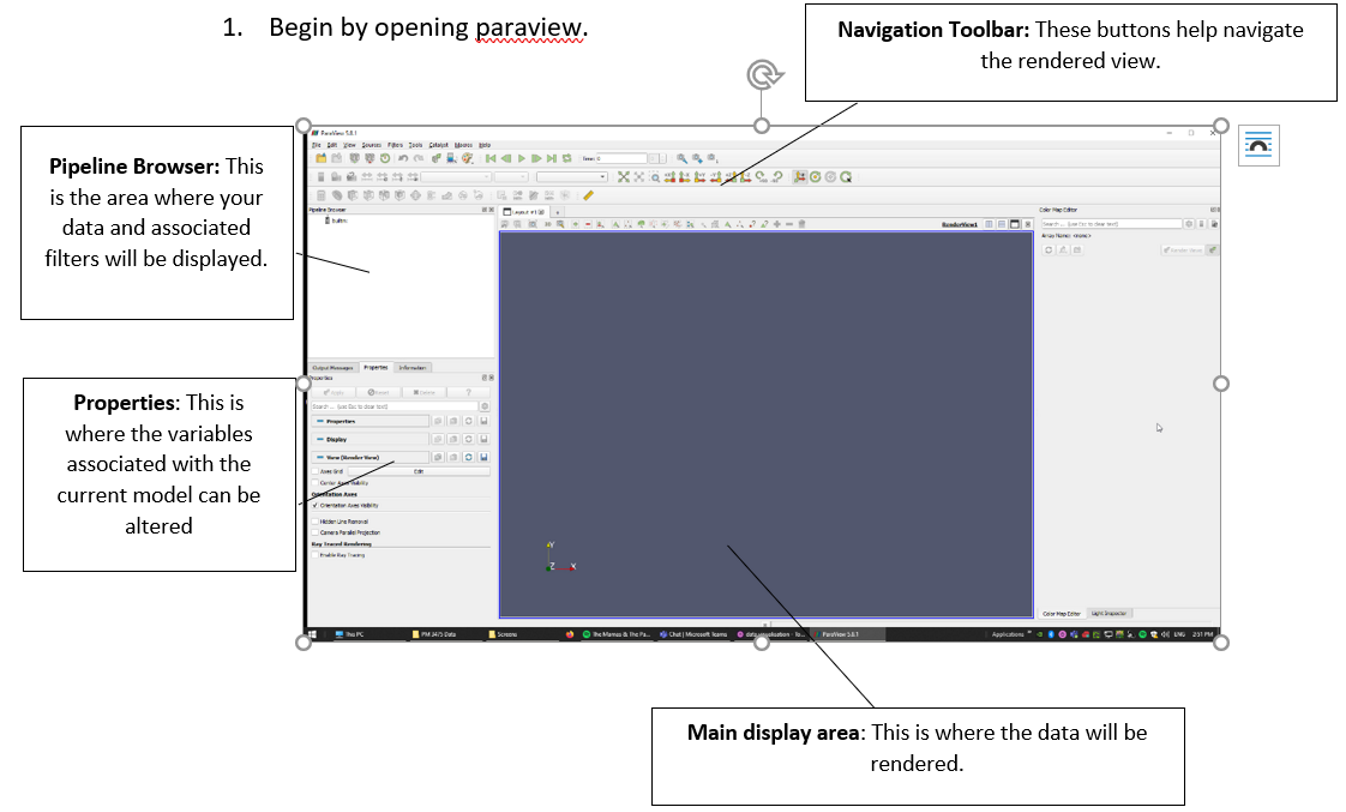
Begin by opening paraview.
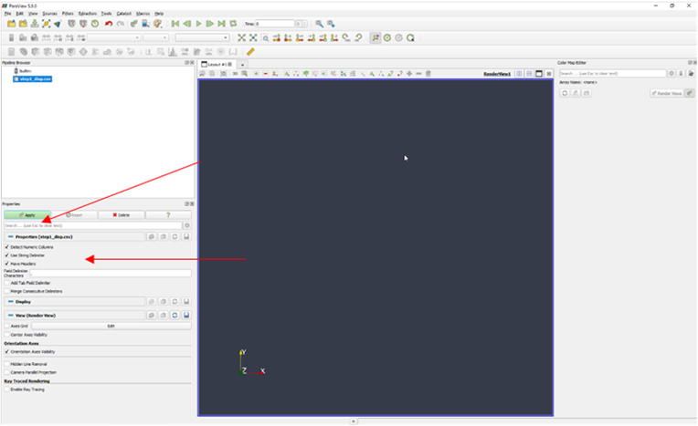
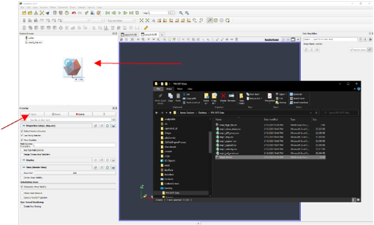
Select the csv data you wish to import and drag and drop the file into the pipeline browser on the left-hand side. At first nothing will happen. This is because the data has not fully been imported yet. Beneath the pipeline viewer, in the properties tab you can change how the data will be imported. Set Detect Numeric Columns, Use String Delimiter and Have Headers to true by ticking these boxes. They may already be ticked by default. The Field Delimiter Character should be set to “,” if you are using csv data. These settings can be changed to accommodate other file formats that may use a different delimiter such as a space character or “:”. Click the green highlighted apply button. Your computer may hang for a second, depending on the size of the data set.
Another window will open, this time it will display the contents of a spreadsheet. This layout is called “spreadsheet view” and is useful for displaying data, for instance, when measuring specific points.
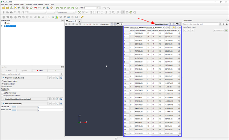
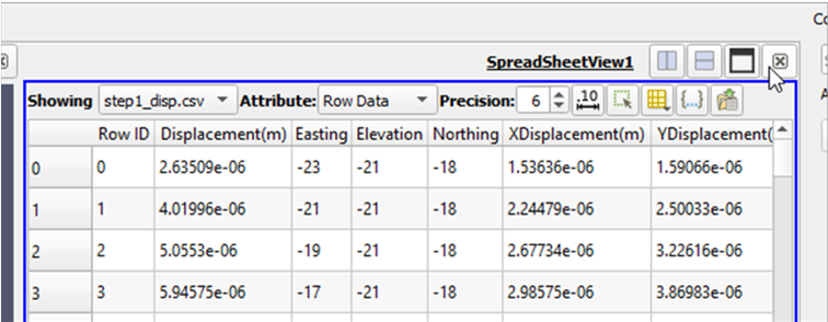
Paraview does not access the file you imported in its raw form. Rather it imports the entire table and then saves it. You can close this spreadsheet view by clicking the x button demonstrated.
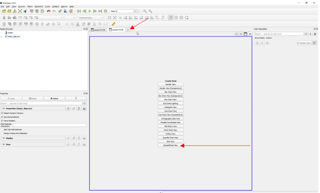
If you wish to get it back, click the + on the tabs directly above the render view, choose spreadsheet view and the window will open again.
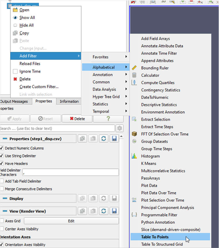
A “filter” must be added to view the data as a graphical representation. Right click the csv data in the pipeline view and select add filter, followed by alphabetical then table to points. Nothing will happen immediately. The program will still need to be told the overall structure of the data.
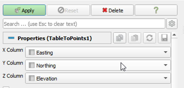
Make sure the “table to points” filter is highlighted in the pipeline browser and then navigate to the Properties window immediately below the pipeline browser. Set the X column to “Easting”, the Y column to “Northing” Z column to “Elevation”. This selection is somewhat arbitrary in the sense that it does not matter to which column the different points are assigned if they are consistent with the example geometry.

To check this, you may import an stl file of the reference geometry in order to check for alignment. To import an stl file, drag and drop the desired file into the pipeline browser in the same manner as the csv file was added. Do not forget to hit the apply button to finish importing the geometry. For a full list of available formats see here, however STL and OpenFOAM seem to be the most common formats for reference geometry.
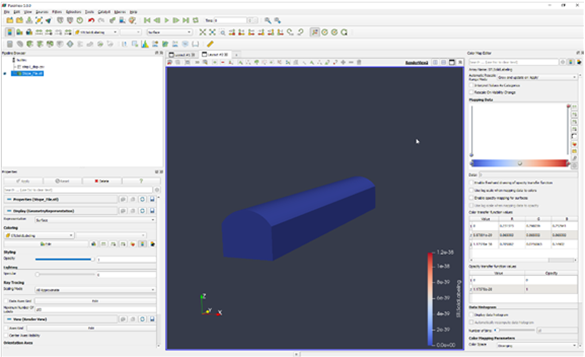
If the table to points filter does not match the STL file, chances are that one or more of these axes are assigned incorrectly. If you a seeing a single plane, or straight line, then the assignment of the columns from step 7 has not been performed correctly. Otherwise, the result of applying the table to points filter will be a point cloud as demonstrated above that is aligned with the reference geometry.
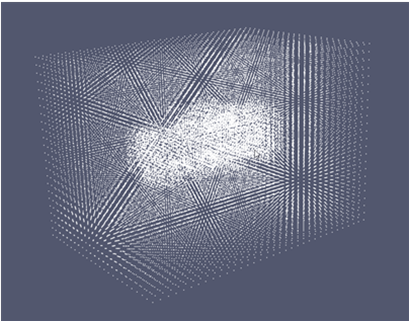
Right now, the point cloud is represented by solid-coloured individual points. However, this can be altered to reflect a scale of data, based on another column. In the top menu bar, click where it says solid colour and change this field to displacement. This will start the “colour map editor” on the right-hand side of the layout window.
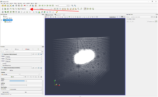
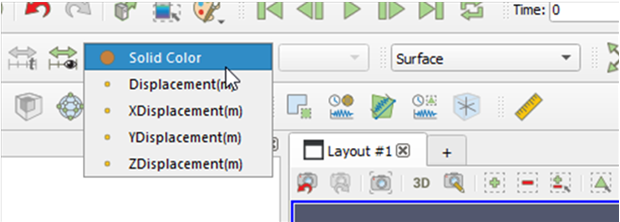
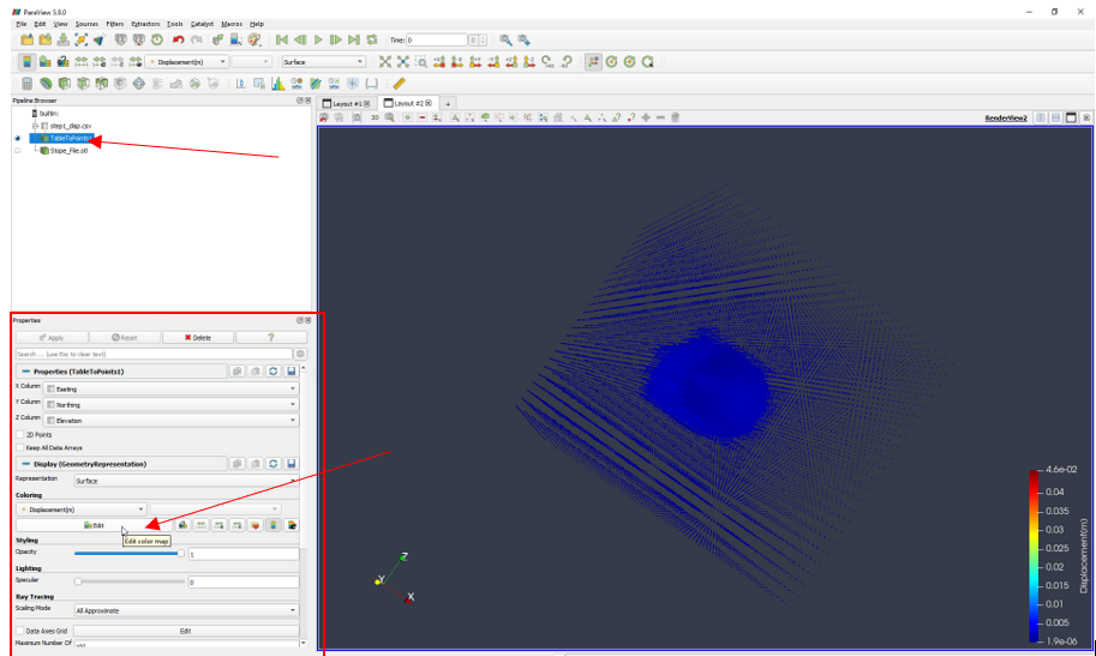
If, for whatever reason, the colour map editor does not open, you can open it manually by, highlighting the Table to Points Filter in the Pipeline Browser. In the Properties Tab, under Coloring, click the Edit button. For reference, please see below.
This colour map can be changed by clicking the icon with the heart on it on the right-hand side of the mapping data histogram. The overall scale can also be changed by double clicking on the axis line (to the right or left of the mapping data histogram. See if you can do the following: Set the scale by double clicking the axis as shown to 0.0 -> 0.02. Click and drag the histogram line to remove the low end of the scale. Finally adjust the colour scheme to inferno matlab by clicking on the folder with the heart icon on it to the right-hand side of the mapping data. The plot should resemble what is shown above.
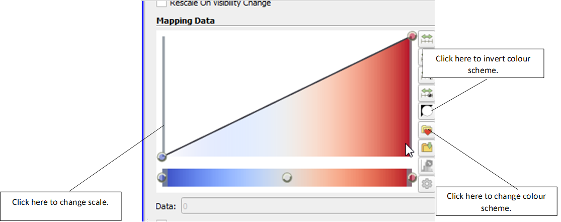
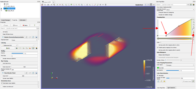
Once you are happy with the color scheme, you can save it as a preset by clicking the save to preset button as shown below.
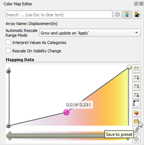
You may wish to filter values within a subset of the specific range. For example, say the total range is between 0.0 and 0.04. If you click on the line between two points you can add a third point as shown.
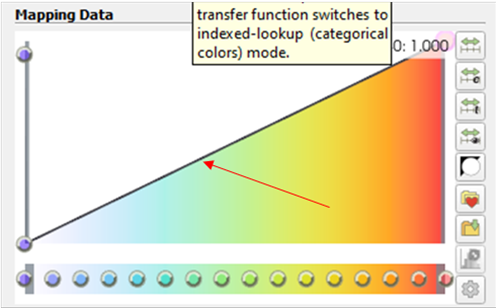
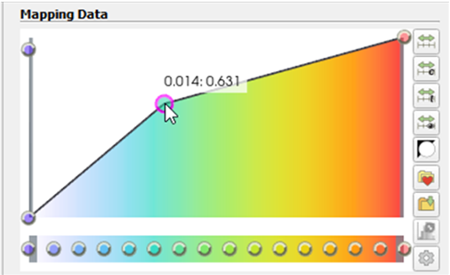
Left clicking adds a point. Using the middle mouse button deletes a point. You can set the opacity of that point by clicking and dragging the point that you have added. If the opacity is set to zero, then you will not see values below this number. This should be reflected by the geometry in the layout window.
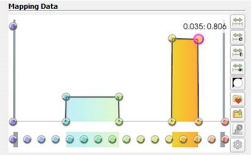
You can add many points such that the mapping data histogram will look like this below. The result of doing this will be a chart of two partially highlighted areas. Note the scale on the right-hand side of the final image has only got colour data between the two points we just defined in the mapping data tab.
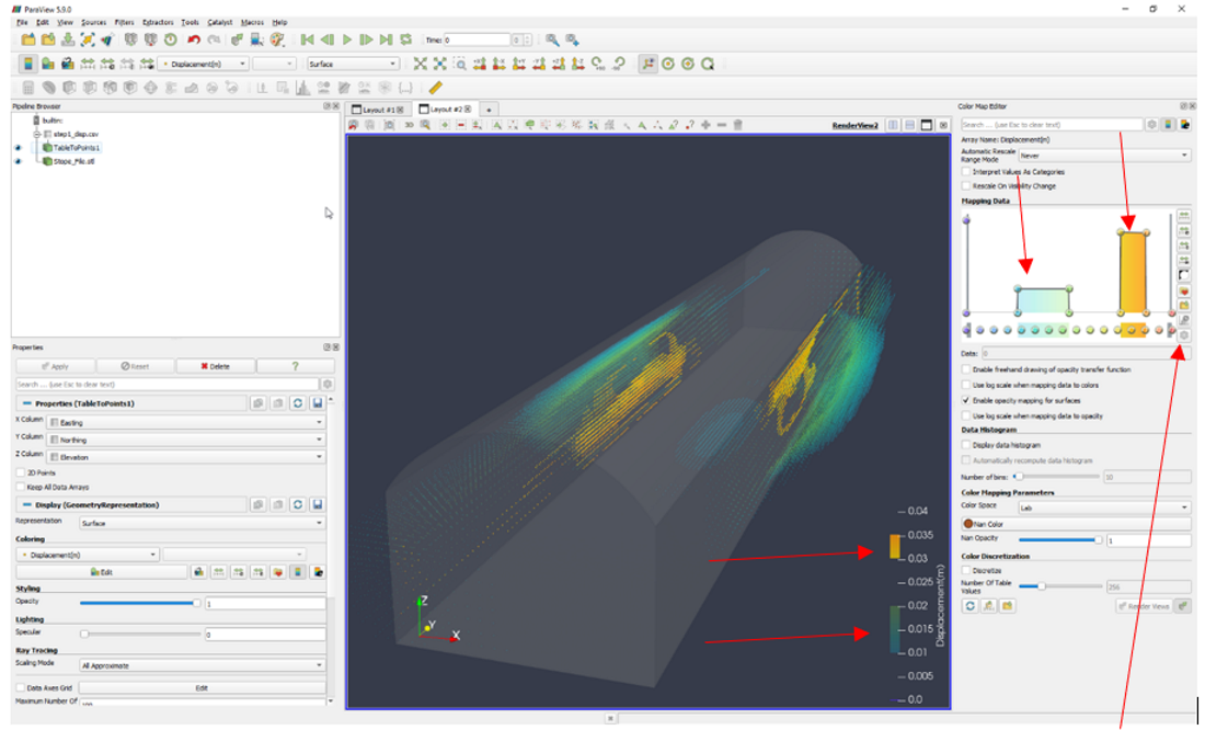
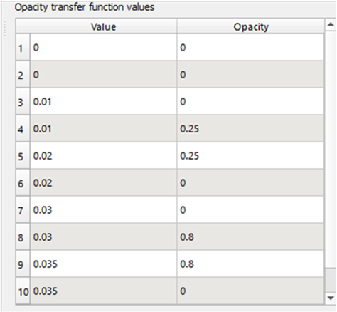
Settings can be manually edited by clicking on manually edit transfer functions by clicking on the gear icon underneath the presets button. In this case the opacity between 0.01 and 0.02 has been set to 0.25 and the opacity between 0.03 and 0.035 has been set to 0.8. This is reflected in the histogram of the colour map.
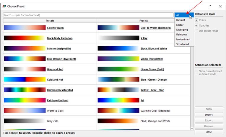
You can load a preset by clicking the heart shaped icon directly above save preset. Be sure to expand the list of presets to include all available presets by clicking the filter box next to the search bar. By default, only a handful of presets are shown without activating this filter.
Add the Stope file by dragging and dropping the file into the Pipeline Browser. Make sure to turn the visibility of the file on by clicking the eye icon next to the file name.
With this file selected, navigate to the properties window below.
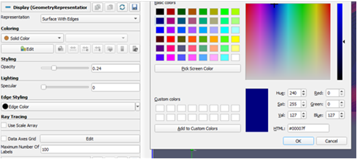
Start by clicking edit, under the coloring menu and change the colour to a dark blue as demonstrated below. Next change the Opacity to 0.24. You can also change the Edge colour of the model under Edge Styling. Note that this option will only be available if the representation of the image is set to surface with edges.
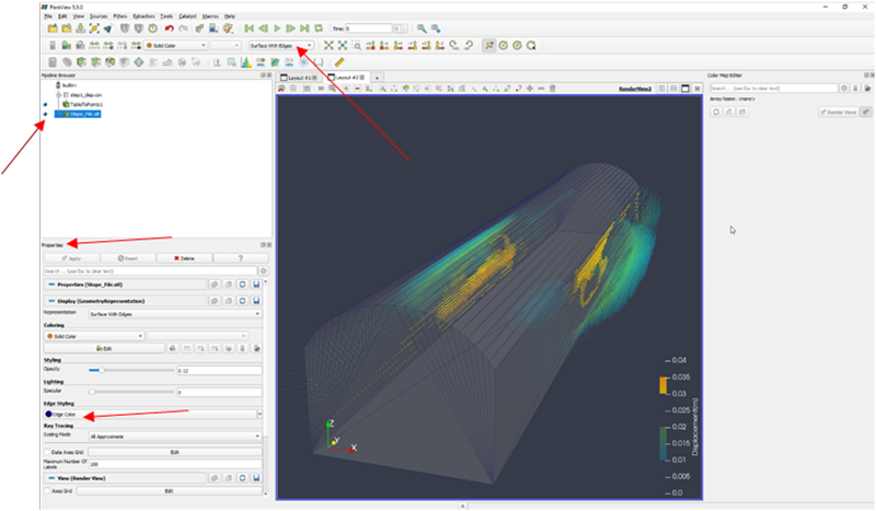
The net result of these changes should be an overlay of the stope file as demonstrated below. If your example does not align, it may be due to an issue encountered in step 7. Double check that your X, Y, Z columns are correctly mapped.
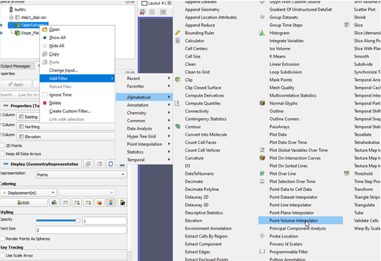
- One of the issues you may notice is that the data is being expressed as individual points. Although it is an accurate representation of the data that was supplied to the program, it does not look particularly good. It would be better if the points resembled more a contiguous volume. One way to approximate this look is to use the point volume interpolator. Right click the table to points filter, select Add Filter, navigate to Alphabetical then select Point Volume Interpolator.
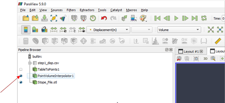
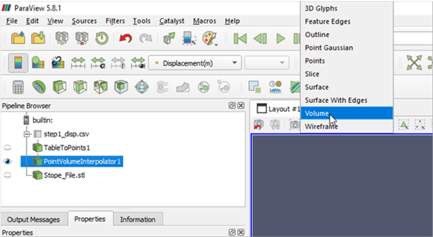
You may not see anything at first, but there is a good chance that the layer just is not turned on. Make sure the PointVolumeInterpolator layer is visible by selecting the visibility icon (the eyeball) and then making sure that displacement is rendered as a volume as demonstrated below
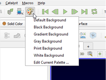
- The background can be changed by clicking the colour palette button in the top bar. Try changing the background to the Gradient type.
- Try using the light inspector to add some lighting to the scene. The Light Inspectori s, conveniently, a little out of the way. You will find it next to the colour map editor as an alternative tab, down the bottom. If you cannot find it, in the top menu bar navigate to view then turn on the light inspector.

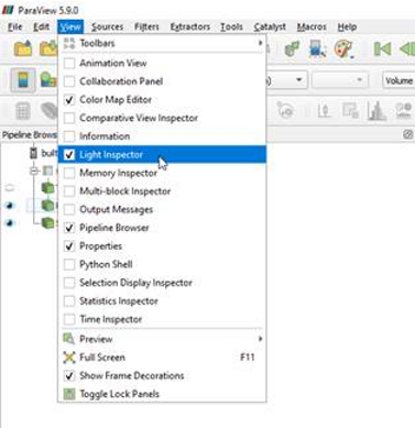
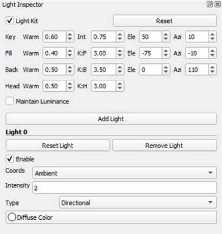
There are many options with the light inspector which are too numerous to go through each in detail. If for whatever reason you cannot see the light inspector go to view in the top menu bar. Check the light inspector box.
Begin by clicking add light, followed by changing the to the ambient type with an intensity of 2.
The result of making a few of these changes is the scene below. These are just guidelines that may be followed to produce nice looking charts, but using a colour wheel really helps to get the render to look visually appealing. For more on colour theory, see here
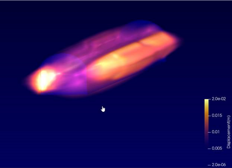
A volume render is nice, but what about vectors? There is a way to view these too, but it is a little tricky. Start by turning off your visualisations and then selecting the csv data in the pipeline browser. Just above where it says pipeline browser there is a very conveniently grey coloured calculator icon. Highlight tabletopoints1. Pushing this button opens a calculator.
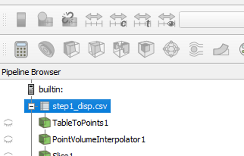
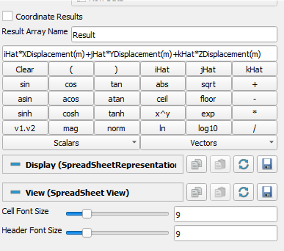
The problem we have is that to display this correctly we need a calculated vector field. This takes on the generalised form.
ihat * XVector + jhat * YVector + khat * ZVector
You must enter this generalised form into the calculator, but it is easier than it sounds.
The iHat, jHat and kHat, vector component buttons can be found in the top right-hand corner of the calculator. Your scalar components can be found under the Scalars drop down menu. You can name the resultant array anything you like, but in this case, we have left it as Result
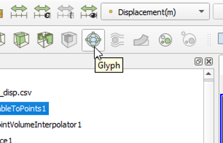
Add a Glyph filter by clicking the button as shown below.
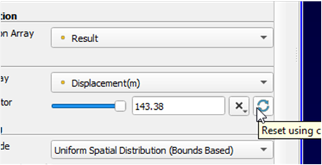
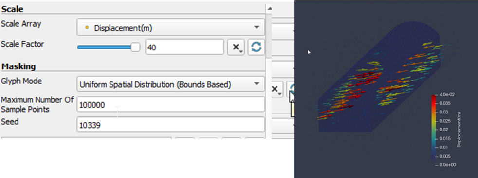
This next part can be difficult. With the newly created glyph filter selected, have a look in properties and you will see Scale Factor. Try hitting the refresh button next to it to get an idea of where the vectors are. The number of glyphs can all be changed in this menu. Make sure that “orientation array” is set to our calculated array from Step 0. Find some numbers that approximate the data best by changing the scale as well as the mask. For a rough guideline. Please see below. One very important thing should be considered here.
Save frequently when using this feature. Trying to render too many points in the wrong way can crash the program. The (reloaded) result is shown below.
