Paraview - Plotting model results as point clouds
Paraview can be used to plot model results in many ways, This post explains how to display contoured point data useful for results across a large model.
Step 1: Getting Started
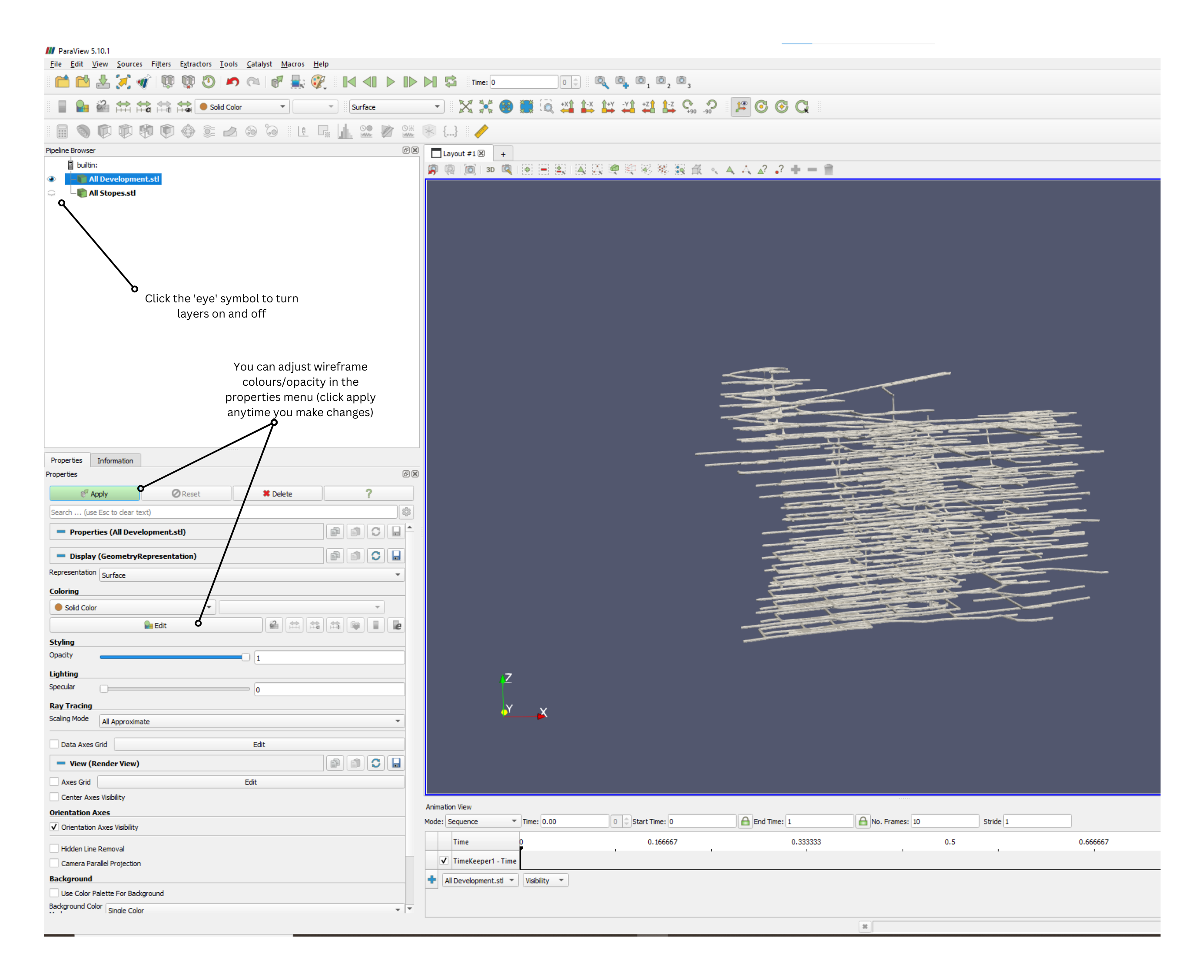
Open Paraview, then drag any wireframe files you want to include into the window. In this case I have imported files to include all excavations.
Make sure to drag the stl files in one at a time.
Step 2: importing model results.
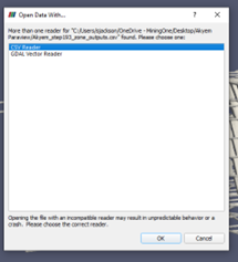
Drag the zone outputs csv file into the paraview window, as you did with the stls. This time a dialogue box will open. Select ‘csv reader’ then click ‘OK’.
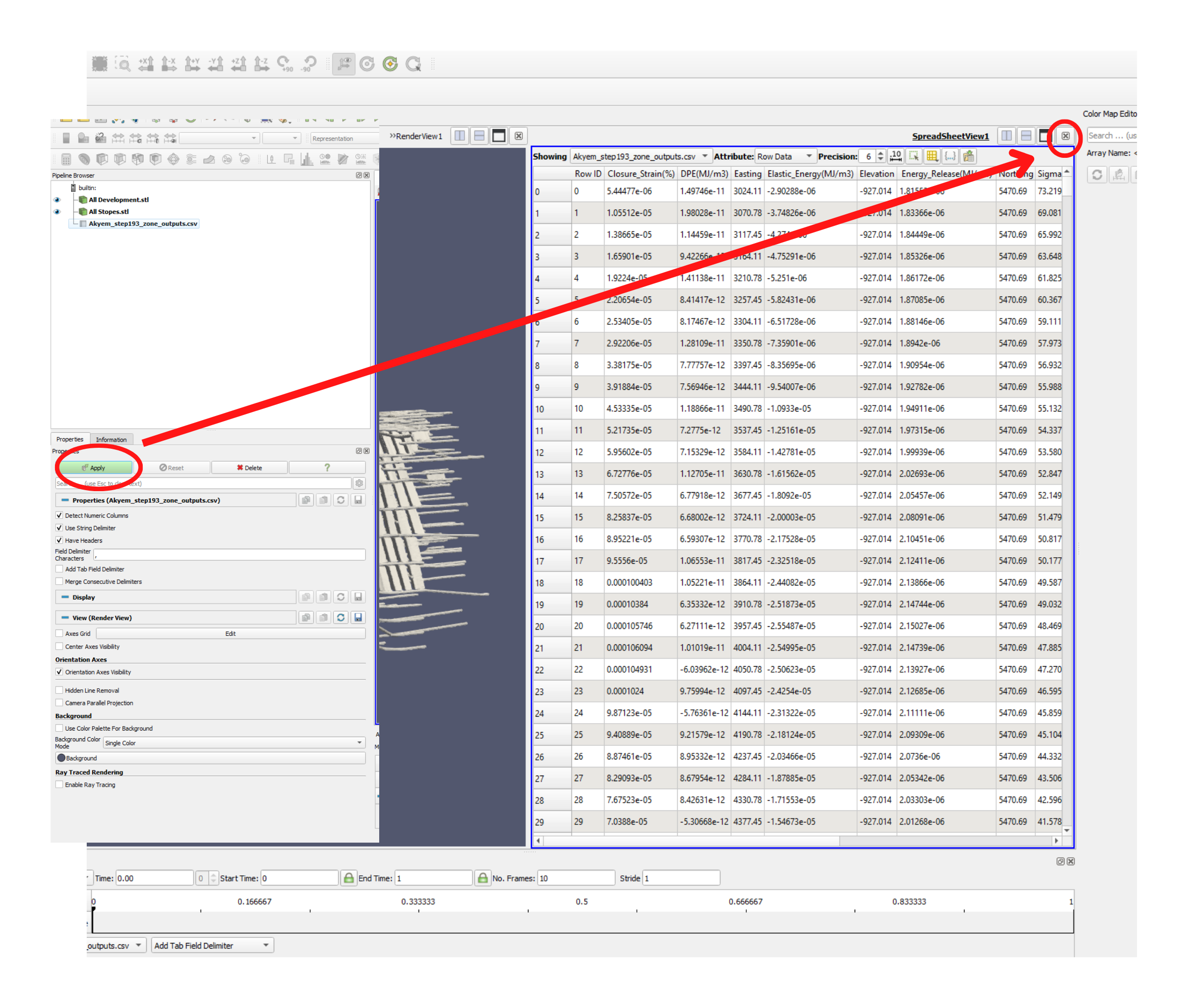
The data is now shown in the layers panel, but nothing will be visible yet. Click Apply and a table viewer will appear, you can close the table viewer.
Step 3: Converting the table into Visual Data
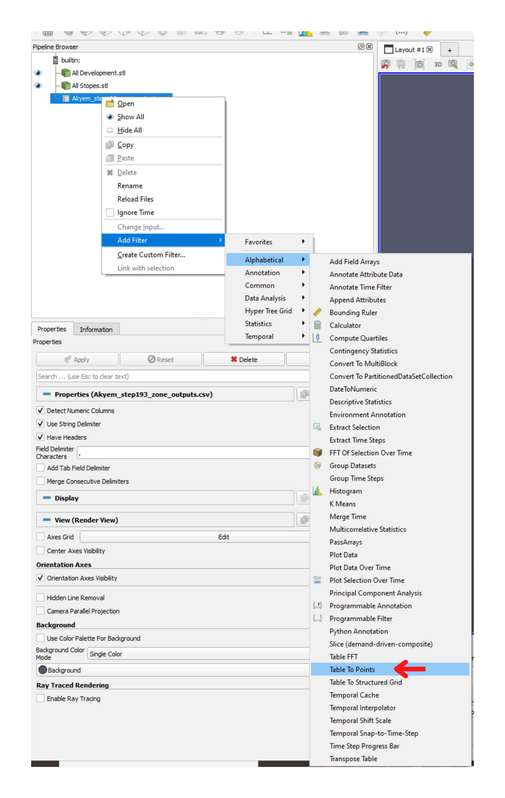
Right Click on the csv file in the browser on the left of your screen
Got to: Add Filter>Alphabetical>Table To Points
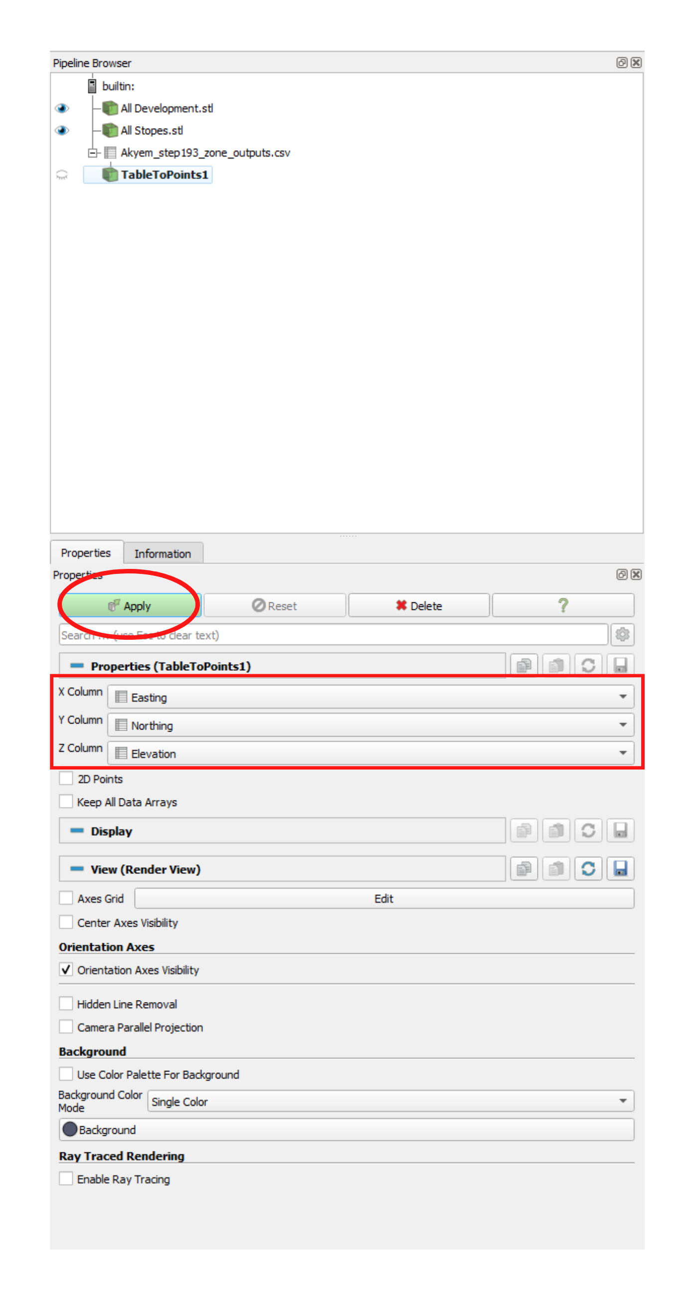
Next set the columns in the table that are the x, y, and z attributes, then click ‘Apply’
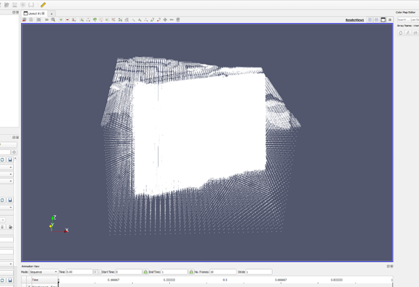
The Points will now be visible in the main window.
Step 4: Contouring the Point Data
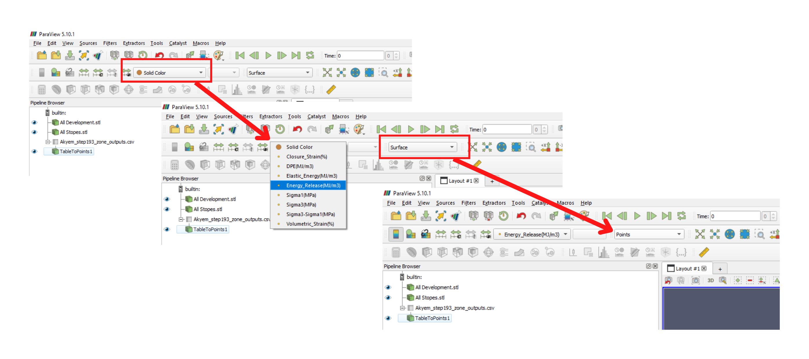
Set the colouring methodology to use one of the results parameters, in this example I’m using Energy Release. Also set the representation to ‘points’ using the drop down menus pictured here:
Next the colour mapping must be adjusted.
On the right of your screen you should see the Colour map editor
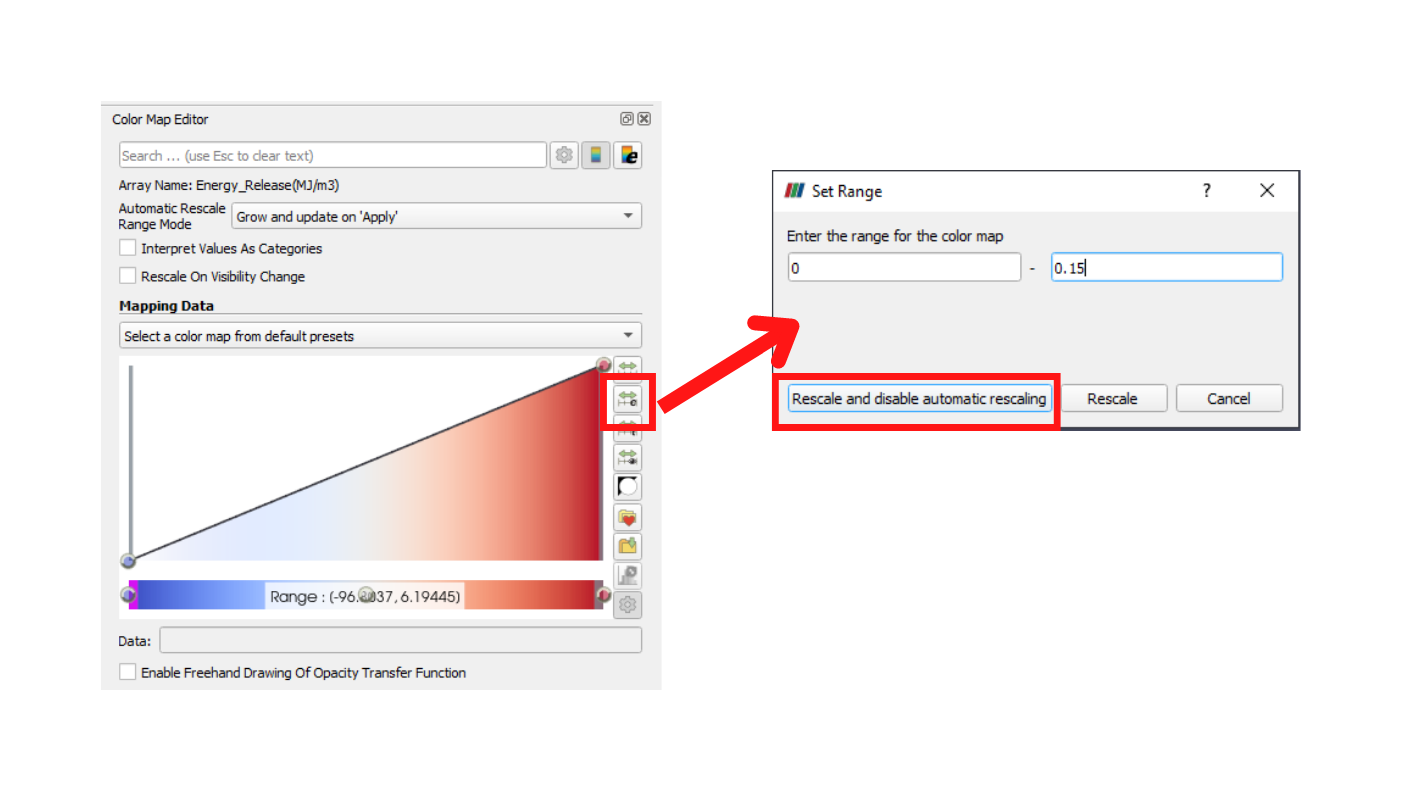
First set the minimum and maximum contour values using the option shown below:
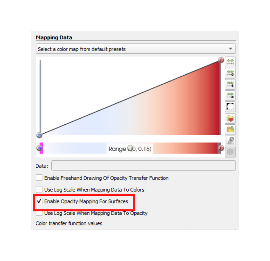
Check the option to ‘Enable Opacity Mapping For Surfaces’
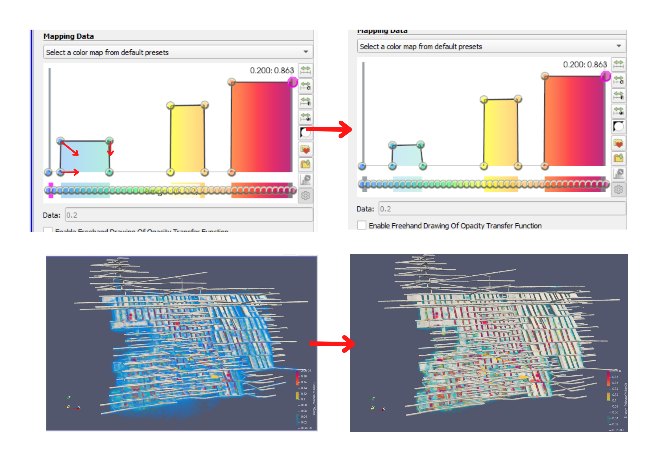
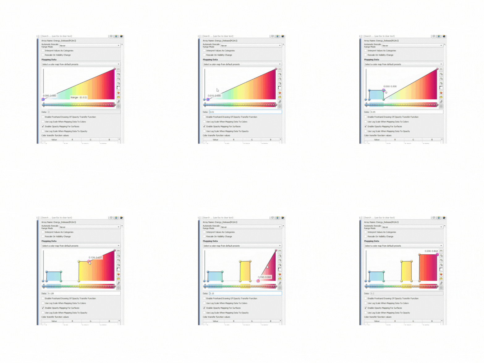
Next you may select a colour ramp from the drop down menu, then manually edit the values. Moving the points upwards increases opacity. There is no exact way to do this, just trial and error until the plot looks good.
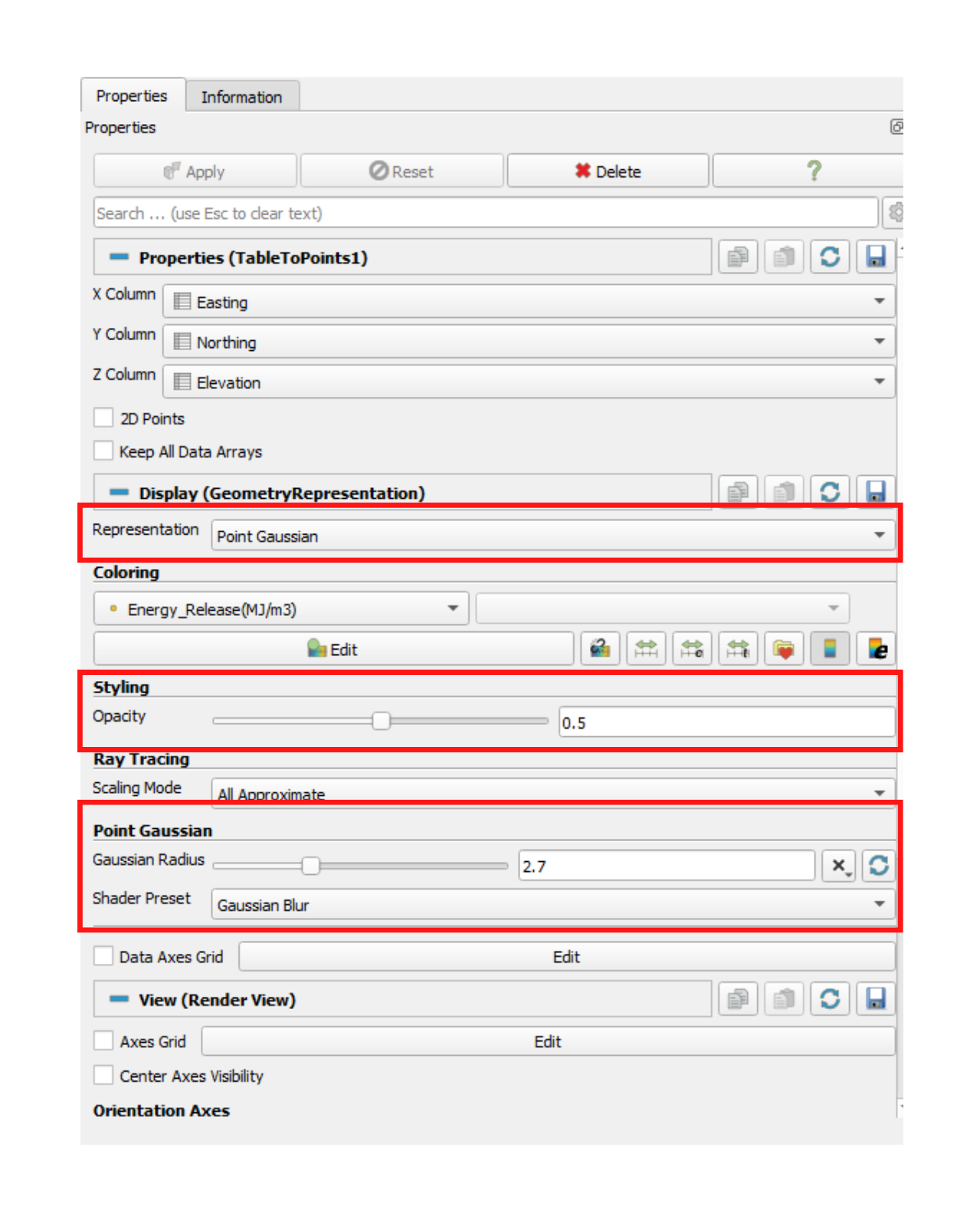
Finally, Adjusting how the points are displayed creates a contouring effect – use the following settings as a starting point.
The final image from these settings looks like this:
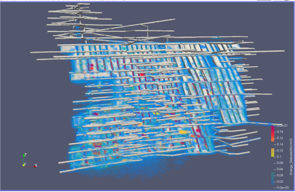
It is possible to reduce the opacity of the blue values to clean up the plot, do this by dragging the points on the colour map lower, and reducing the width of the blue area cuts out some of the lowest values from the plot.
The contours will automatically be applied to other csv files added to the project, when you plot an attribute with a matching name.
